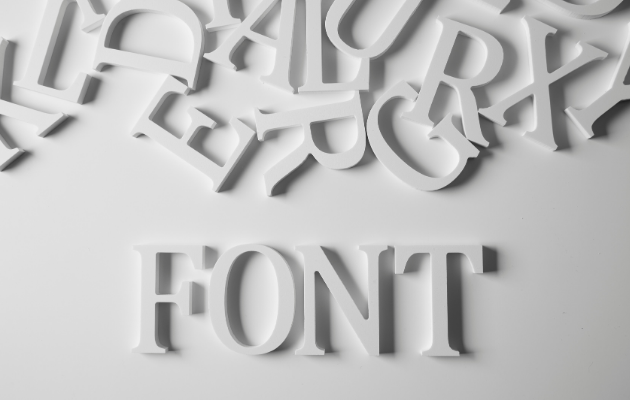
What is the best resume font and font size?
Use a clean, standard, widely supported font and keep sizing in a recruiter-friendly range: 10–12 pt for body text and 14–18 pt for section headings. The best option is the one that stays easy to scan on-screen, remains ATS-safe, and fits your content without looking cramped or oversized.
Why It Matters
Recruiters often decide whether to keep reading in the first few seconds, and font choice plus size directly determines readability and scan-ability. Small text, inconsistent styling, or “stylish” fonts can make a strong resume look unprofessional and can also create parsing problems when systems read your content.
Readable + ATS-Safe Typography Framework
- Choose a clean, widely supported font: Pick a simple, professional font that renders consistently across devices and common file types. Avoid decorative or unusual fonts—legibility and consistency are the priority for resumes.
- Set body text to 10–12 pt: Use 10–12 pt for your main content (experience bullets, summary, skills) so it remains easy to read on screens and doesn’t force over-compression.
- Build hierarchy with headings (14–18 pt) and minimal emphasis: Make section headings clearly larger than body text (about 14–18 pt) and use bold consistently for key items like job titles or company names. Keep emphasis restrained so the page stays easy to scan.
- Edit content instead of shrinking below 10 pt: If you feel pressure to drop below 10 pt to fit more text, cut, reorder, or tighten bullets instead. Micro-fonting harms readability and signals weak prioritization.
- Export and verify at 100% zoom: Export to a common format and review it on a laptop screen at 100% zoom. Confirm headings are obvious, bullets are readable, spacing is consistent, and nothing shifts or crowds after export.
If you’ve been applying without hearing back, use bechosen.app to build an ATS-optimized, recruiter-friendly resume designed to turn applications into interviews.
Real-World Example
A candidate with 5 years of experience starts with a two-page resume draft. They set body text to 11 pt for experience bullets and skills, and set section headings (Summary, Experience, Skills, Education) to 16 pt bold to create clear structure. Instead of shrinking body text to 9 pt to force a single page, they remove older, less relevant bullets and tighten wording so the most relevant accomplishments stay prominent. After exporting, they review the file at 100% zoom to confirm it’s easy to scan and that spacing and alignment didn’t change.
Common Mistakes to Avoid
- Choosing decorative or unusual fonts to “stand out,” which reduces readability and can render inconsistently.
- Reducing body text below 10 pt to fit more content instead of tightening or removing bullets.
- Mixing multiple font families or applying inconsistent styling across sections.
- Overusing bold/italics/underlines so the page has no clear visual hierarchy.
- Skipping a final review of the exported file at 100% zoom, missing spacing/alignment changes.
Frequently Asked Questions
What font should I avoid for my resume?
Avoid decorative or overly stylized fonts like Comic Sans or Papyrus, as they can make your resume look unprofessional.
Is it okay to use different fonts in my resume?
It’s best to stick with one font throughout your resume for consistency and professionalism.
How can I ensure my resume is ATS-friendly?
Use standard fonts, avoid images and graphics, and keep formatting simple to ensure ATS can read your resume correctly.
What if my resume is too long?
Focus on editing out less relevant experience and tightening your bullet points instead of reducing font size.